
How to Create an Effective Landing Page for Your Startup
A landing page has a simple job: convince the right person to take the next step. That might mean booking a demo, requesting a quote, joining a waiting list, starting a trial or buying a product. Whatever the conversion is, everything on the page should help the visitor understand what you offer, why it matters and what they should do next.
For startups, that sounds straightforward. In practice, landing pages often become overloaded very quickly. Founders want to explain every feature. Marketing wants to include every campaign message. Sales wants more qualification questions. Investors want the company story to feel bigger.
Before long, a page that should communicate one clear idea is trying to communicate ten. An effective landing page does the opposite. It reduces the amount of thinking required from the visitor and creates a clear path from interest to action.

The first thing to establish is who the page is actually for.
Trying to speak to everyone usually results in messaging that feels relevant to no one. A startup may serve several customer groups, but that does not mean every audience needs to receive the same landing page.
A finance platform could have one proposition for freelancers, another for small businesses and another for larger organisations. The underlying product may be the same, but the problems, priorities and reasons to buy can be very different.
Before designing anything, define the audience, the problem they are trying to solve and the action you want them to take. That gives the page a purpose. From there, the most important part is usually the first screen.
A visitor should be able to understand what you offer within a few seconds. They should not need to interpret abstract statements, scroll through three sections or watch a product video before the proposition makes sense:
- Your headline should communicate the main value clearly.
- Your supporting copy should add the context needed to understand it.
- And your primary call to action should make the next step obvious.
That does not mean every startup needs a generic headline such as “The easiest way to manage your business.” Clear does not have to mean boring. Strong positioning can still be distinctive, opinionated and memorable.
But creativity should reinforce understanding rather than replace it.
A good landing page should make the next decision easier, not give the visitor more things to think about.
Visual hierarchy is what turns that message into an experience.
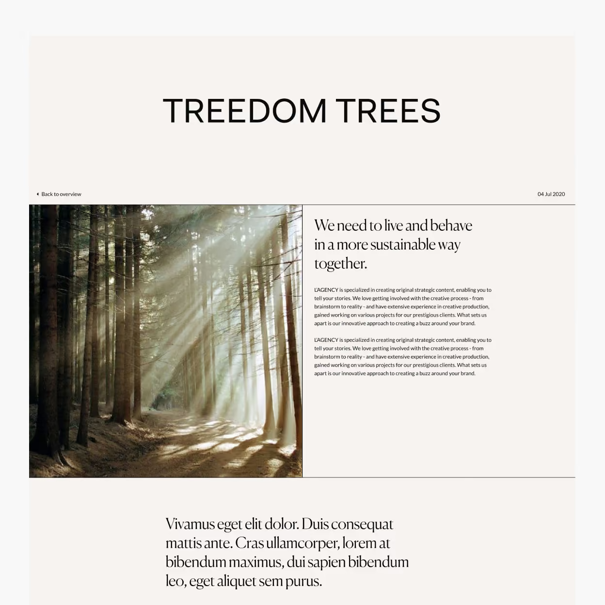
Visitors rarely read landing pages from top to bottom. They scan them. Headlines, imagery, numbers, testimonials and calls to action are often processed before paragraphs of supporting copy. The design therefore needs to establish priorities:
- What should the visitor notice first?
- What should they understand second?
- What information do they need before they are comfortable converting?
- Typography, spacing, contrast, imagery and motion all help guide attention through that sequence.
The best landing pages often feel simple because a significant amount of thinking has gone into deciding what does not need to be there.

Build the Page Around the Decision
Once the proposition is clear, the rest of the page should answer the questions preventing someone from acting. A useful way to think about the structure is as a conversation:
- You introduce what the product does.
- The visitor thinks, Is this relevant to me?
- You demonstrate the problem or use case.
- They think, How does it work?
- You explain the product.
- They think, Can I trust this company?
- You introduce customers, results, testimonials, case studies or other evidence.
- They think, What do I need to do next?
- You give them a clear call to action.
This creates a much stronger flow than simply assembling a standard collection of website sections.
Social proof is particularly important for startups.
Established brands already carry a degree of familiarity. A newer company often has to create that confidence within the page itself. Customer logos can help, but stronger proof usually provides context. Instead of only saying that companies use your platform, show what happened when they did.
A short testimonial with a concrete outcome, a statistic from a customer project or a small case study can be significantly more persuasive than an anonymous quote describing the product as “great”.
The same applies to product claims:
- If you say the platform saves time, explain how. If you say implementation is easy, show the process.
- If you claim the product improves conversion, demonstrate the result.
- Specificity creates credibility.
- It also makes the landing page more useful to someone comparing several potential solutions.
Forms deserve the same level of attention.
- Every additional field introduces friction, so ask only for information you actually need at that stage.
- If someone is downloading a guide, you probably do not need their company size, telephone number, annual revenue and purchasing timeframe.
- If they are requesting a consultation for a complex B2B service, more qualification may be reasonable.
- The form should reflect the size of the commitment.
The same principle applies to the CTA itself.
- “Submit” tells the visitor what the interface is doing.
- “Book a consultation”, “Start your free trial” or “See the product in action” tells them what they are getting.
- Small differences in wording can make the next step feel much clearer.
Performance is another part of conversion that is easy to overlook.
A beautifully designed page is not effective if visitors wait several seconds for it to become usable. Large videos, unnecessary scripts, oversized images and excessive animation can all undermine the experience, particularly on mobile. This matters even more when the landing page is being used for paid campaigns. Every click has a cost, so losing visitors because of poor performance means paying for traffic that never gets a reasonable opportunity to convert. Optimise imagery, load assets intelligently, keep third-party scripts under control and test the page on real mobile connections rather than only on a fast office network.
Mobile design should also be considered independently rather than treated as a compressed desktop layout.
The order of information may need to change. Navigation may disappear. Forms may become shorter. Product visuals may need different crops or interactions. The objective remains the same: make understanding and acting as effortless as possible.
Once the page is live, treat it as a starting point rather than a finished product. Analytics can show where visitors drop off, which traffic sources perform best and whether people actually reach important sections of the page. Session recordings and heatmaps can reveal behaviour that basic conversion numbers cannot.
Sales conversations can uncover objections the page does not answer. And experiments can help determine whether changes to messaging, structure or calls to action improve performance.
But testing works best when there is a hypothesis behind it. Changing a button colour simply because it can be measured is rarely useful.
Testing a stronger proposition because visitors appear to misunderstand the product is much more meaningful. The biggest opportunities are usually strategic rather than cosmetic:
- A different audience.
- A clearer message.
- A stronger offer.
- Better proof.
- Less friction.
- More relevant traffic.
- Those improvements can have a much greater impact than endlessly optimising small interface details.
Ultimately, an effective startup landing page is not defined by how many sections it has or which design trend it follows. It works because the page understands the visitor. It communicates one strong proposition, supports it with credible information and makes the next action feel obvious.
For startups, that clarity is particularly valuable. You are often introducing something unfamiliar, competing against companies with greater recognition and asking potential customers to trust a business they may only have discovered a few minutes earlier.
The landing page has to close that gap quickly:
- Start with the audience.
- Define the conversion.
- Make the proposition clear.
- Build the page around the questions people need answered.
- Remove anything that creates unnecessary friction and continue improving the experience once real users begin interacting with it.
The objective is not simply to create a page that looks good. It is to create a page that helps the right people understand your startup and gives them a compelling reason to take the next step.
At H5.Digital, we combine strategy, UX/UI design, development and optimisation to create landing pages and digital experiences built around measurable business goals.
If you are launching something new or want to improve the performance of an existing landing page, tell us what you are working on.